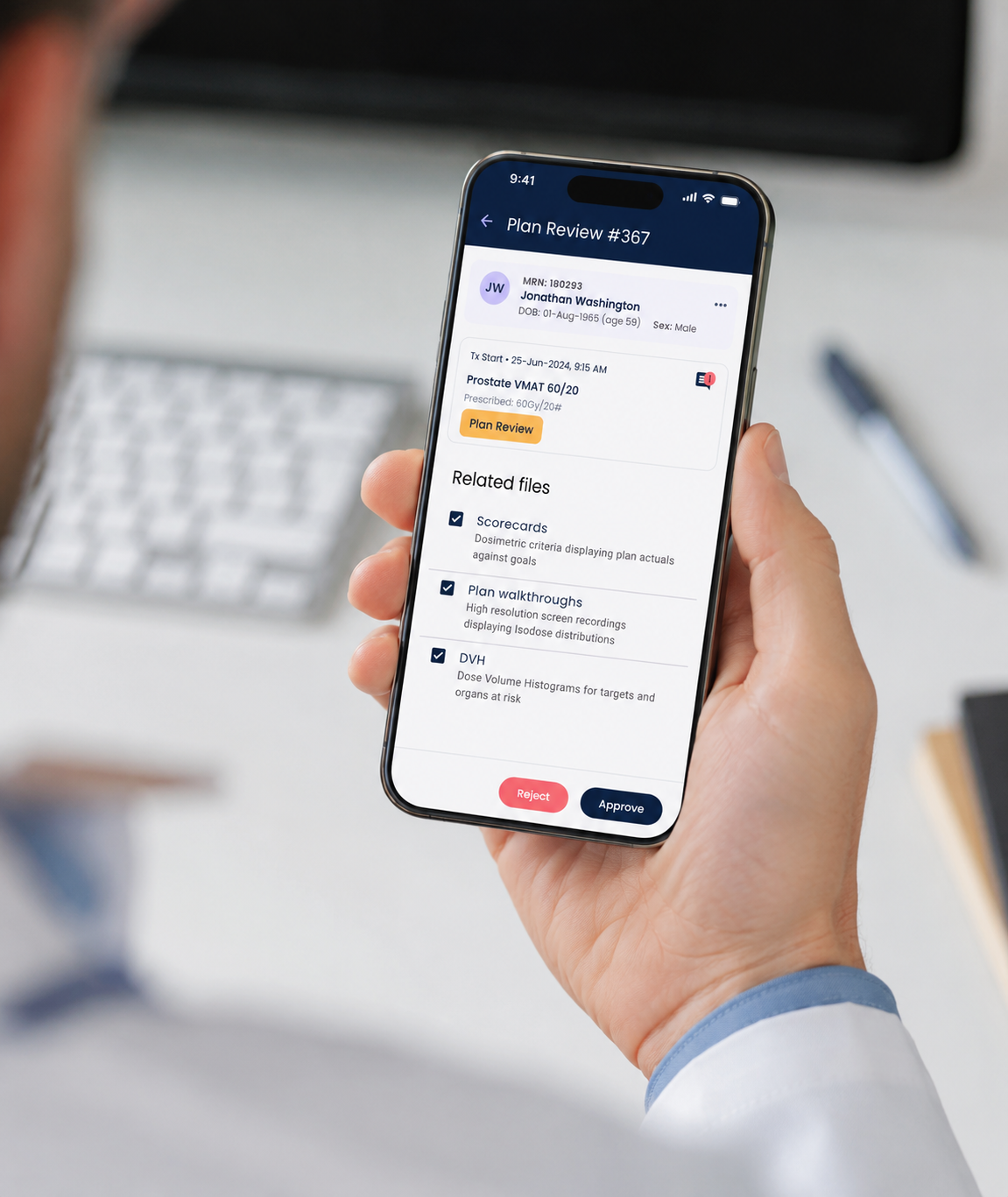
Giving doctors the power to act from anywhere.
My role
Product Design - UX Research, Interaction Design, Mobile UI, User Interview.
Impact
Removed the laptop dependency for urgent approvals
Doctors can now review, approve, or push back on a CarePlan from their couch, their car, or a holiday. What previously required logging into a desktop system can now be resolved in under a minute from a phone.
Faster response times for patients
Urgent plans no longer sit waiting because a doctor is offsite. The mobile app means the doctor can act the moment they're notified, reducing care delays outside of clinic hours.
Reduced after-hours friction for clinical teams
Coordinators and nurses no longer need to chase doctors by phone or text. The in-app chat creates a single, contextual thread tied directly to the patient and their plan.
THINKING PROCESS
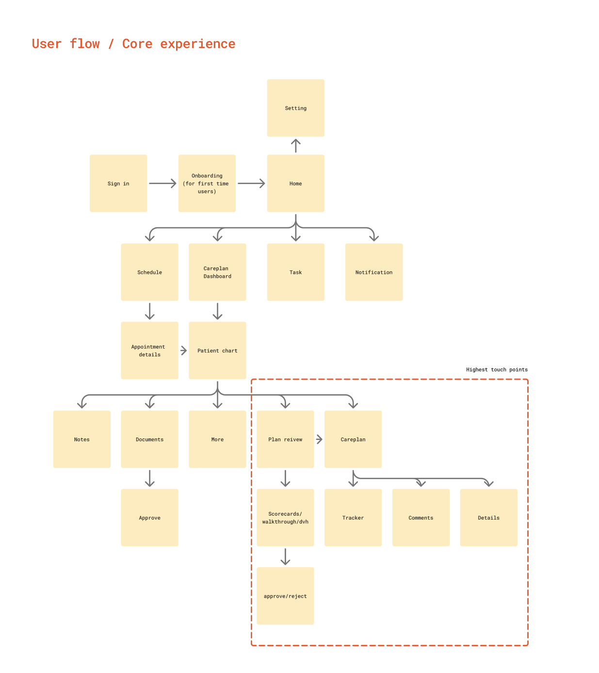
Problem
CarePlan approvals are time-sensitive. When a patient's plan is ready for sign-off, it often needs a doctor's eyes quickly but doctors aren't always at their desk. The only way to action a plan was through the desktop web, which meant carrying a laptop, finding a connection, logging in, and navigating to the right patient. Outside of clinic hours, this friction caused real delays. Doctors described the experience as either being fully “on” with a laptop, or completely unreachable. There was no middle ground.
Solution
I designed a mobile app that brings the two most urgent workflows -> CarePlan review and clinical chat -> to a doctor's phone.
The CarePlans view gives doctors a clear list of outstanding plans requiring their attention, flagged by urgency. Each plan opens into a structured summary: patient details, the proposed task list, any supporting notes from the team, and clear approve or request actions. The interaction is intentionally simple, a doctor half-watching TV at 9PM should be able to action a plan in a few taps without re-reading the same information three times.
The Chat feature is tied directly to each patient and plan, so conversations stay in context. Doctors can ask the care coordinator a quick question, clarify a note, or confirm a decision without the thread getting lost in a generic messaging app or an email chain. Notifications surface the most recent message and link straight into the relevant patient record.
The app was designed mobile-first, thumb-friendly tap targets, minimal text entry, and a layout that works in portrait one-handed. The visual language matches the Lumonus desktop platform so doctors moving between devices feel oriented immediately.
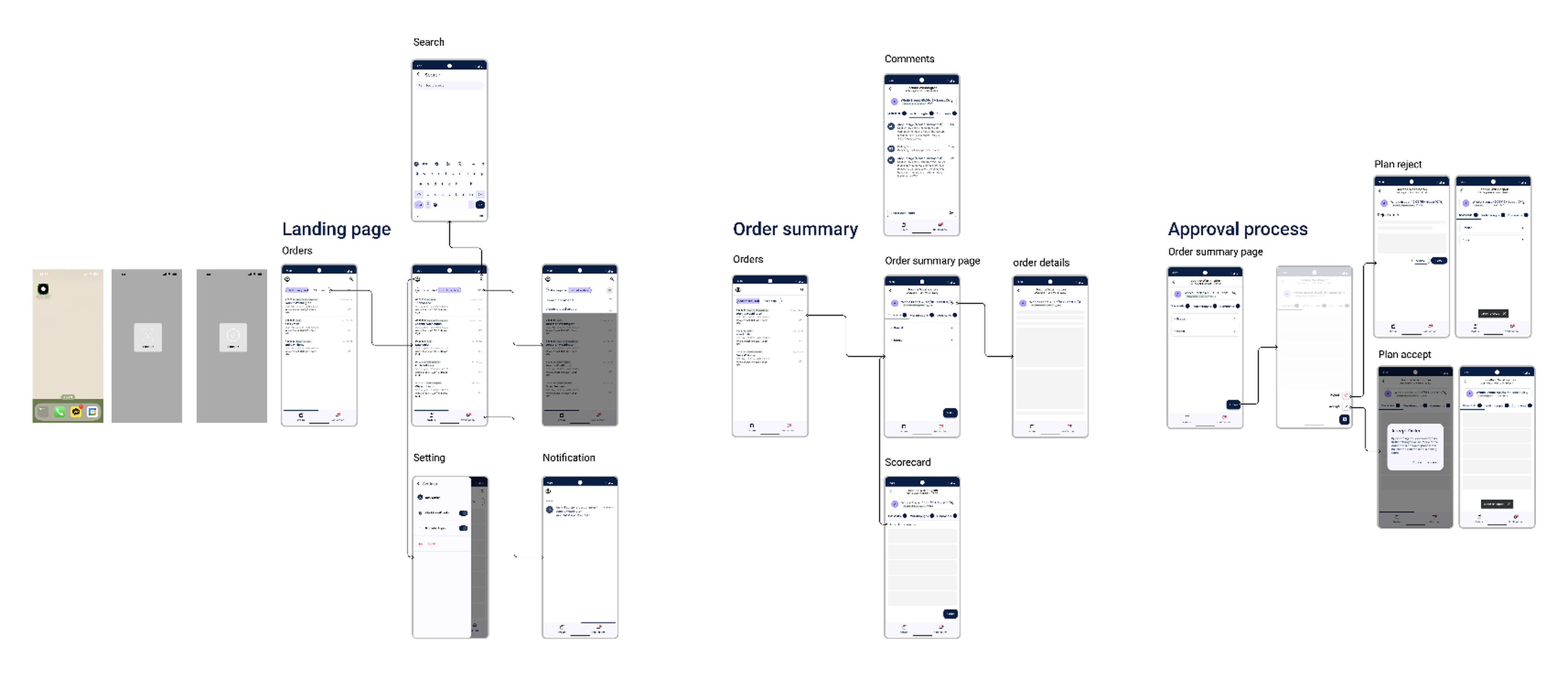
Wireframe
Design decisions
The approve/reject actions are deliberately prominent but not destructive by default - approving is a single tap, but requesting changes opens a short text field prompting a reason. This mirrors how approvals work in real clinical settings: a yes is fast, a no needs context.
Chat was scoped to patient-level threads rather than a general inbox. This keeps conversations actionable and prevents the app from becoming another notification source doctors learn to ignore.
Notification design was kept minimal - one line of context (patient name + action required) so doctors can triage urgency from the lock screen without unlocking the phone.
Result
The Lumonus mobile app gave doctors a genuine third option between being fully available at a desk and being completely offline. Urgent plans can now be reviewed and approved from anywhere, clinical chat keeps communication tied to the right patient context, and the care team has a faster, more reliable way to reach the right decision-maker - without anyone needing to open a laptop.