Redesigning how doctors see their day
My role
Product Design - UX Research, Interaction Design, UI Design, User Interview.
The problem
Doctors were locked to a single daily view. Planning a busy oncology schedule meant clicking through dates one at a time, and starting a consult required navigating away from the schedule entirely.
What I did
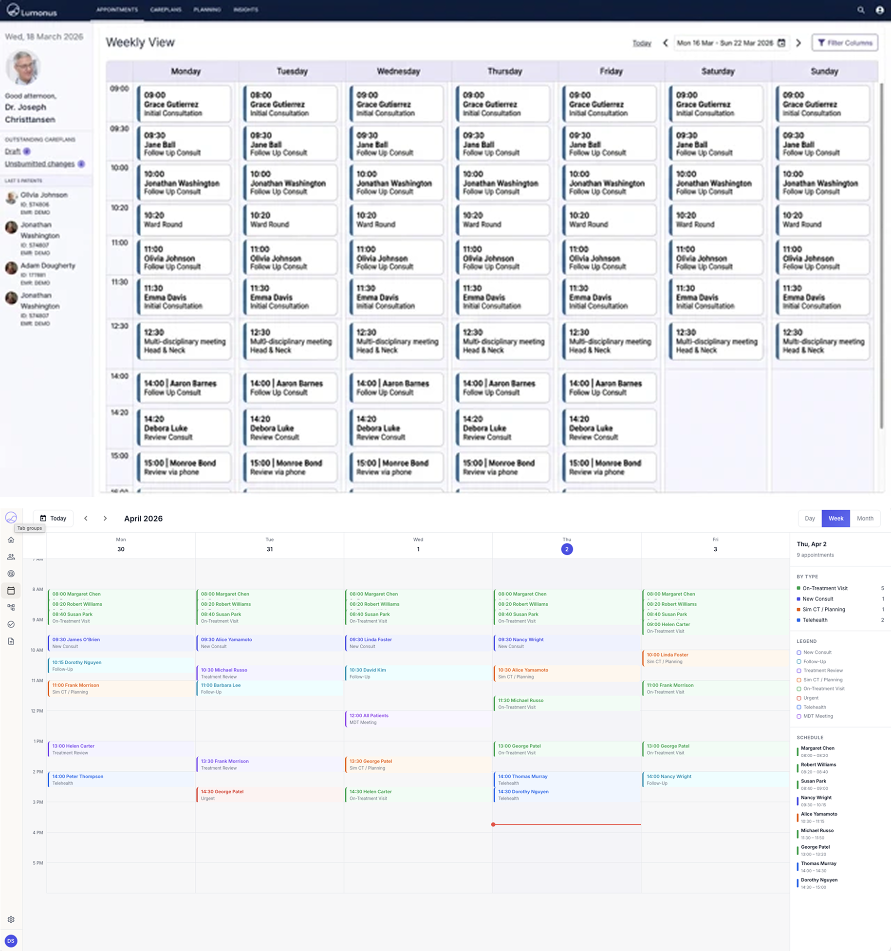
Early in the project I used AI to accelerate ideation, generating a range of layout directions before committing to any structure. Rather than starting with blank canvas, I used prompts to produce rough interface scaffolds. These outputs weren't final designs - they were thinking tools, a way to stress-test structural ideas quickly and identify which directions were worth pursuing in higher fidelity.
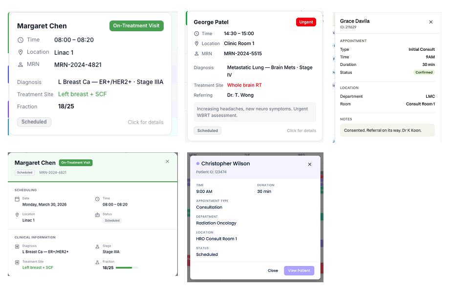
With the overall structure settled, the next design challenge was the patient detail overlay. How to surface clinical context without pulling doctors out of the schedule. I explored several overlay treatments. The hover-anchored floating card emerged as the strongest option, it keeps the appointment list visible underneath, surfaces key details at a glance, and offers a “View Patient” escape hatch for those who need to go deeper.
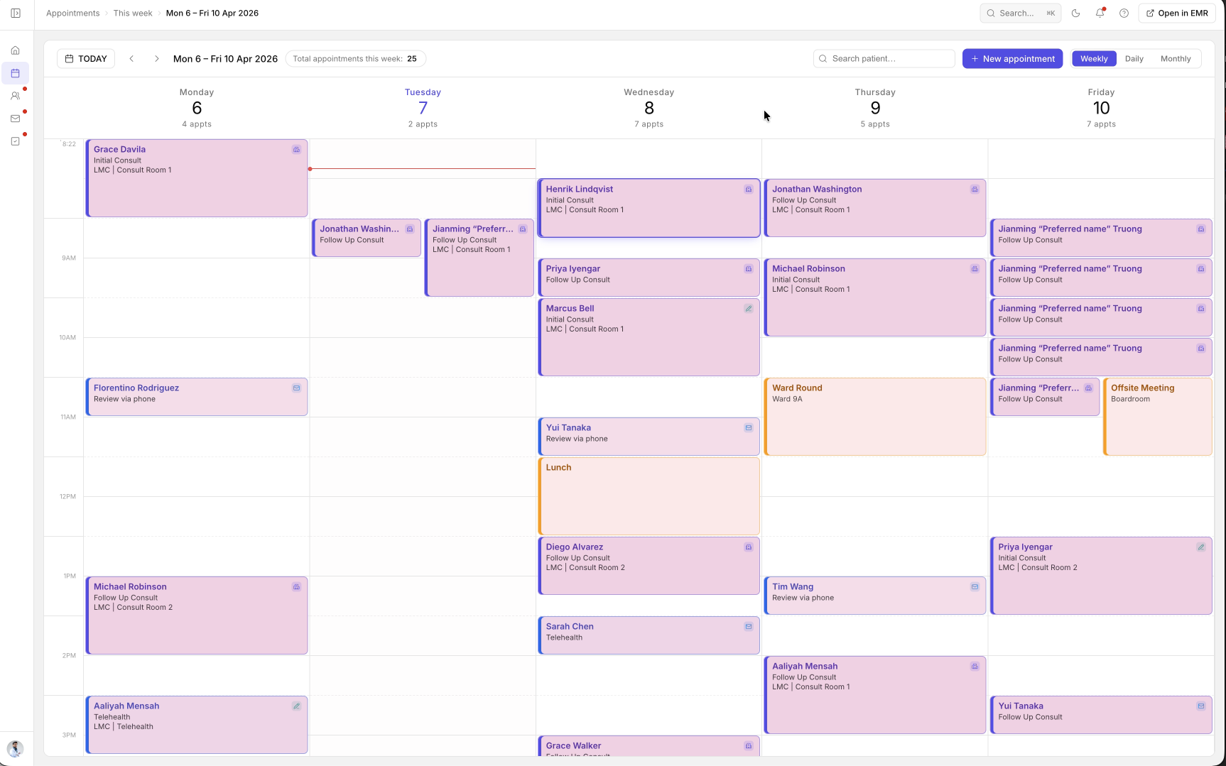
The bigger change: ambient AI recording now launches directly from any appointment card. One tap, patient consent confirmed, Scribe starts listening and drafts a structured clinical note automatically.
Why it matters
Less time navigating, more time with patients. The schedule became the starting point for the entire consult - not just a list to check before the real work began.
Impact
Reduced the number of clicks required to navigate between appointments and start a consultation.
Reduced time spent managing schedules by 62%, allowing doctors to focus more on patient care.